25 Aug Exterior Signage That Sells: How the Right Sign Brings in More Customers
If your storefront is a stage, your exterior sign is the spotlight. It introduces your brand, signals trust, and turns drive-bys into drop-ins – often in seconds. The right sign doesn’t just “look nice”; it performs. It attracts qualified foot traffic, reinforces your positioning, and can measurably lift sales. Here’s how to design exterior signage that doesn’t just decorate your building – but sells.
Why Exterior Signage Matters More Than You Think
Studies consistently show that a large portion of first-time customers discover a business because of its signage. That means your sign isn’t a finishing touch; it’s part of your acquisition engine. Great signage:
- Builds instant credibility. A clean, well-lit, professional sign signals reliability and attention to detail.
- Improves discoverability. Clear, legible signage rescues you from “invisible storefront” syndrome—especially crucial on high-speed roadways.
- Strengthens brand memory. Consistent colors, fonts, and shapes create mental “hooks” that help people remember you later.
- Drives impulse visits. When the sign answers “What is this place?” and “Is it for me?” quickly, you win spur-of-the-moment stops.
- Works 24/7. Unlike most marketing, a sign performs every hour of every day without added media spend.
The 5 Jobs of a Sales-Driving Sign
Think of your exterior sign as a salesperson with five must-hit objectives:
- Be found. It must be visible from appropriate viewing distances and angles, day or night.
- Be read. It must be legible – fast. No guesswork, no squinting.
- Be understood. It should communicate what you do or what makes you different at a glance.
- Be remembered. It should align with your brand identity so people recall you later.
- Be compliant. It must meet local codes and accessibility considerations to avoid delays or fines.
Nail those five and you’ve created a sign that supports traffic and revenue – not just aesthetics.

Match the Sign Type to the Mission
Choosing the right format is a strategy decision, not just a style preference. Here’s how common sign types earn their keep:
- Channel Letters: Individually fabricated letters (front-lit, reverse/halo-lit, or combo) that deliver a premium, architectural look. They’re ideal for brand-forward retail, restaurants, and professional services aiming for high visibility and modern credibility.
- Cabinet/Box Signs: A versatile, cost-effective workhorse for simple wordmarks or logos. Great for strip centers and multi-tenant buildings where uniformity is required.
- Monument Signs: Ground-level structures at entrances boost wayfinding and brand presence, especially for campuses, medical facilities, and offices set back from the road.
- Pylon/High-Rise Signs: The right call when elevation matters – think highways, multi-tenant centers, or locations obscured by landscaping or setbacks.
- Blade/Projection Signs: Perpendicular to the building, perfect for walkable districts where pedestrians approach from the sidewalk. They punch above their weight in visibility per square foot.
- Window Graphics & Perfs: Extend your brand canvas and add promos or hours without permanent structure changes. Excellent as supplemental messaging to a primary sign.
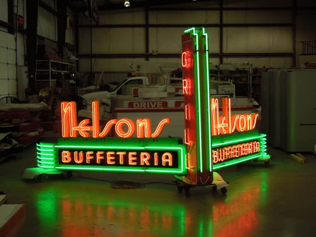
- Neon & LED Accent Lighting: Classic neon or modern LED “neon” gives character, warmth, and nighttime pop – especially for hospitality and entertainment brands.
Design That Sells: Practical Guidelines
Even beautiful signs fail if they’re hard to read. Keep these proven design principles front and center:
- Prioritize legibility. Choose high-contrast color pairs (e.g., dark letters on a light face or vice versa). Avoid thin scripts or condensed fonts for your main ID line, especially at a distance.
- Size to speed. The faster the traffic, the larger the letter height and stroke width you need. As a quick rule of thumb, each inch of letter height yields roughly 10 feet of readable distance in ideal conditions.
- Limit the message. Your primary sign should do one thing: identify your brand. If you must add a descriptor, keep it short – “Dental | Implants & Family” beats a paragraph.
- Use brand assets wisely. Lock up your logo for maximum clarity. Simplify busy emblems for signage, and stick to a disciplined color palette for recognition.
- Think daytime and nighttime. A design that pops in sunlight can disappear after dark without proper illumination. Review both renderings before you approve.
- Design for the background. Your wall color, masonry pattern, or sky backdrop affects contrast. Spacers, raceways, or halo lighting can help separate the sign from the surface visually.
Illumination: Your 24/7 Advantage
Lighting is one of the biggest levers for ROI because it extends your reach and improves legibility. Consider:
- Front-Lit Channel Letters: Bright, direct visibility for primary identification.
- Reverse/Halo-Lit: Refined glow that elevates brand perception at night.
- Combination Lit: Front + halo for premium presence in competitive corridors.
- LED Cabinets & Edge-Lit Panels: Energy-efficient, low maintenance, and reliable.
- Smart Controls: Photocells and timers ensure the sign is on when it should be and off when it shouldn’t – saving energy and protecting components.
Consistent illumination also signals that you’re open, attentive, and professional. A flickering or partially lit sign communicates the opposite.
Materials & Fabrication: Built for Longevity
The best-looking sign is the one that still looks great in five years. Materials matter.
- Aluminum & Aluminum Composite (ACM): Durable, corrosion-resistant, and lightweight – excellent for cabinets, pans, and monument cladding.
- Acrylic & Polycarbonate Faces: Acrylic offers crisp clarity; polycarbonate brings extra impact resistance for high-wind or vandal-prone areas.
- High-Output LEDs: Select reputable diode brands and appropriate color temperatures (often 5000–6500K for white) for even, long-lasting light.
- Powder-Coated Finishes: Hold color and resist chipping far better than standard paint.
- Quality Vinyl Films: For window graphics and changeable elements, premium films resist fading and peeling.
Choosing sturdy materials reduces service calls, keeps your brand sharp, and protects your investment.

Placement & Sightlines: Where Your Sign “Catches” Customers
A great sign in the wrong place won’t sell. Before installation, analyze:
- Approach speeds and angles. Are drivers approaching from a curve, hill, or intersection? Angle the sign face for maximum “on-time.”
- Obstructions. Trees, lamp posts, parked vehicles, neighboring canopies – plan for current and potential future obstacles.
- Primary vs. secondary ID. Pair a building sign with a monument or pylon for early detection and confirmation as customers draw near.
- Pedestrian vs. motorist audiences. In mixed-use areas, a blade sign plus window graphics can outperform a single large fascia sign.
Good installers will model sightlines and propose mounting solutions that maximize visibility without breaking code.
Measure What Matters: From Visibility to Revenue
You can connect signage to business outcomes. Track:
- Traffic lift. Compare foot traffic and POS transaction counts before and after install.
- Directional queries. Monitor “Where are you located?” calls/messages – these usually drop when signage improves.
- Promo tie-ins. Use a short vanity URL or code shown on window graphics to attribute redemptions.
- Map ratings & photos. Branded exterior photos on your Google Business Profile increase clicks and “directions” taps.
- Service calls. Fewer outages and repair tickets indicate healthy ROI from quality components.
This data helps refine future sign investments and justifies upgrades (like illumination or a monument) to stakeholders.
Multi-Location & Rebrands: Consistency Without Sameness
For franchises and growing brands, balance consistency with site-specific optimization:
- Create a signage standards kit. Define approved logos, color values, materials, lighting types, and minimum letter heights.
- Adapt to architecture. Maintain brand rules while respecting each building’s constraints for a polished, intentional look.
- Plan a phased rollout. Prioritize high-visibility or underperforming sites first to capture quick wins.
- Centralize service. A single point of contact for maintenance keeps every location on-brand and fully lit.
Done well, a cohesive exterior presence becomes a competitive moat – customers find you easily and perceive scale and stability.
Budgeting Smart: Think Lifetime Value, Not Line Item
Sticker price matters, but the cheapest sign can be the most expensive over time. To budget wisely:
- Weigh total cost of ownership. Factor in energy efficiency, service intervals, and replacement cycles.
- Invest where it counts. Prioritize letter height, illumination quality, and placement over ornamental extras.
- Bundle projects. Multi-sign or multi-site orders often unlock better pricing and tighter brand control.
- Finance or phase. If cash flow is tight, stage improvements – start with primary ID and lighting, then add a monument or blade sign.
When you view signage as a revenue asset, the case for quality becomes clear.
Ready to Refresh Your Curb Appeal? We Can Help!
A high-performing exterior sign is equal parts strategy, design, fabrication, and service. When those pieces come together, your storefront doesn’t just look better – it sells better.
If you’re planning a new location, rebranding, or simply want to boost visibility and foot traffic, partner with a team that handles the entire lifecycle: site survey, code research, design, permitting, fabrication, installation, and maintenance.
At Acura Neon, our goal is to deliver signage that looks sharp on day one and keeps working hard for years to come. Let’s turn more passersby into paying customers. Contact us today to get started!

Sorry, the comment form is closed at this time.