
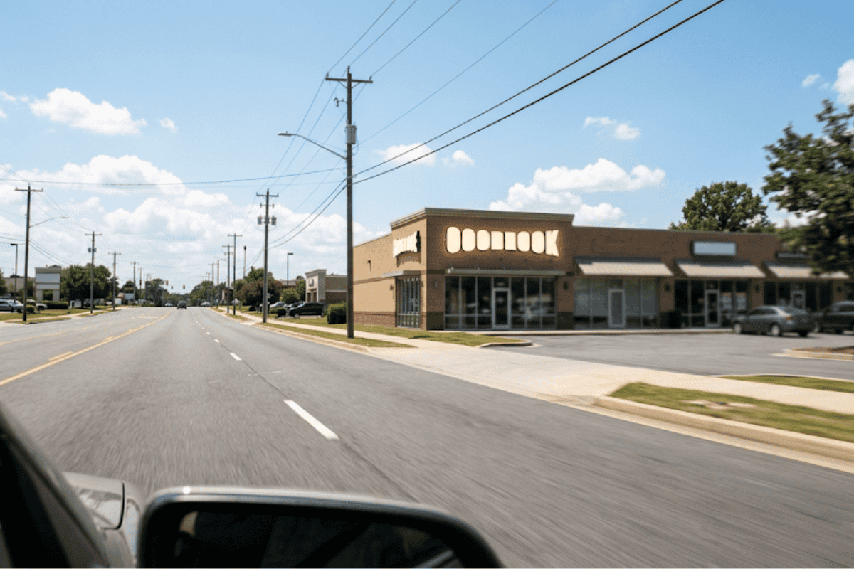
17 Aug How Far Away Should People Be Able to Read My Sign?
The United States Sign Council’s own on-premise sign guidelines put a firm number behind the question of how far away should people be able to read my sign: roughly 30 feet of readable distance for every inch of capital letter height under average conditions. That single figure, known in the sign industry as a Legibility Index, is the starting point for nearly every letter-height decision a sign shop makes, whether the job is a channel letter storefront sign in Broken Arrow, OK or a monument sign set back from a four-lane road. Distance is only part of the story, though. Letter height, viewing angle, traffic speed, and where a sign sits on a building all interact to determine the actual range at which a driver or pedestrian can pick out a business name and still have time to react.
Most business owners ask this question backward. They start with a sign size they like and hope it reads well, instead of starting with the distance customers actually need to see it from and working backward to a letter height. Flipping that order is what separates a sign that looks fine up close from one that actually pulls in traffic from the road.
What the 30-Feet-Per-Inch Rule of Thumb Actually Covers
The Legibility Index of 30 comes from decades of on-premise sign research compiled into the United States Sign Council’s sign legibility guideline, and it is meant to represent average viewing conditions: a sign mounted roughly perpendicular to the direction of travel, moderate visual clutter, and a driver who is already looking in the sign’s general direction. That average number moves depending on the environment. In a visually busy commercial corridor with multiple signs competing for attention, the same guideline recommends applying an adjustment factor of about 0.67 to 0.83, which effectively lowers the usable index to somewhere between 20 and 25 feet per inch. A quieter roadway with less competing signage can support the full 30-feet-per-inch figure or better.
Age of the viewer matters too. Research compiled by the University of Kentucky’s sign legibility research program recommends a more conservative maximum index of 33 feet per inch for general design, dropping closer to 40 feet per inch only under ideal conditions, and a stricter benchmark when older drivers are part of the expected audience. None of these numbers are meant to be exact science down to the inch. They are planning tools that let a sign designer start with a real target distance and land on a letter height that has a reasonable chance of working, rather than guessing.
Letter Height and Distance: The Numbers Behind Every Sign Design
Applying the standard 30-feet-per-inch index produces a straightforward relationship between letter height and how far away a sign is likely to be readable. A 3-inch letter is legible from about 90 feet away, a 4-inch letter reaches roughly 120 feet, and a 6-inch letter stretches that range to about 180 feet under the same standard. Move up to 8-inch letters and the readable distance grows to roughly 240 feet. A 12-inch letter, common on many storefront channel letter signs, carries to about 360 feet, and by the time a design reaches 24-inch letters, typical of larger monument or building-mounted signage set well back from the road, the readable distance extends to roughly 720 feet.
| Letter Height | Approximate Readable Distance |
|---|---|
| 3 inches | 90 feet |
| 4 inches | 120 feet |
| 6 inches | 180 feet |
| 8 inches | 240 feet |
| 12 inches | 360 feet |
| 24 inches | 720 feet |
Those figures assume good contrast between the letters and the background, a font without excessive flourishes, and a sign that is not competing with heavy visual clutter nearby. Change any of those conditions and the actual readable distance shifts, which is exactly why the index is described as a rule of thumb rather than a fixed law.
How Far Away Should People Be Able to Read My Sign Near a Busy Road?
Traffic speed changes the answer more than almost any other factor. Research on sign visibility and conspicuity summarized in a sign visibility study published through the University of Oklahoma notes that a sign should generally be legible from a distance, in feet, equal to the posted speed limit in miles per hour multiplied by roughly 8. That works out to about 200 feet of needed legibility distance on a 25 mph street and closer to 440 feet on a 55 mph highway frontage road, since drivers moving faster need more time and distance to notice a sign, read it, and decide whether to slow down or change lanes.
That same body of research also points out that sign legibility distances run about 1.8 times longer in daylight than at night, which is one reason illuminated channel letters and backlit cabinets matter so much for businesses that stay open into the evening. A letter height calculated for daytime driving can fall short after dark unless the sign has enough of its own light output to hold that distance. Federal research on highway sign standards, including a highway sign study on driver visual capability, has also found that the visual acuity assumed by many sign standards is higher than what a meaningful share of drivers, particularly older drivers, actually have on the road. In practice, that means a letter height that just clears the minimum on paper often performs better in the real world when it is sized a bit larger than the bare calculation suggests.
Placement, Height Above Grade, and Viewing Angle
Letter height alone does not guarantee a readable sign. Where the sign sits changes how much of that theoretical distance is actually usable.
- A sign mounted flat against a building, parallel to the road, is viewed at a sharp angle by approaching traffic and becomes legible only within roughly the last 30 degrees of approach, which is why parallel wall signs generally need larger letters than a sign facing traffic head-on at the same distance.
- A sign mounted too high above eye level or set too far back from the curb loses effective reading time even if the letters are large enough, since a driver’s eyes have less time to find, focus on, and process the message before passing it.
- A sign partially blocked by trees, other signage, or parked vehicles for even a few seconds can cut the usable legibility distance well below what the letter height alone would suggest.
- Interior and directional signage follows a different, much shorter scale. ADA guidance covered in the U.S. Access Board’s ADA signage guidelines sets minimum character heights based on viewing distances measured in single feet, not hundreds of feet, because indoor wayfinding and identification signs are read from close range rather than from a moving vehicle.
That last point matters for choosing between sign types, too. A monument sign sits closer to eye level and is typically read at a slower approach speed, while a pole sign trades some of that close-up detail for height that keeps it visible over trees, other signage, and traffic from farther down the road. Matching the sign type to the actual approach distance and speed is as much a part of readability as letter height alone.
Why Choose Acura Neon for Sign Readability in Broken Arrow, OK
Getting the letter height right is not a matter of picking a number off a chart and moving on. Acura Neon’s design process starts with a conversation about the actual site: the posted speed limit on the adjacent road, how far back the building sits, whether the sign will face traffic head-on or be read at an angle, and what the client’s brand and visibility goals are. That consultation shapes every decision that follows, and it typically includes revisions once a proposed letter height and layout are mocked up against the real sightlines of the property, so the design gets refined rather than locked in on a first guess.
That same process carries into how the sign gets built. Once a letter height and layout are set, the fabrication work translates those numbers into an actual channel letter set, cabinet, or dimensional display sized to match, rather than treating the design phase and the build phase as disconnected steps. A sign designed for a 45 mph frontage road in Broken Arrow, OK needs a different letter height than one designed for a walk-up storefront on a slower downtown street, and that distinction gets built into the plan from the first conversation rather than discovered after installation.
Schedule a Sign Readability Consultation to find out what letter height and placement will actually work for your building and its traffic, request a consultation and bring the posted speed limit and viewing distance details to the conversation.
Conclusion: A Realistic Expectation for Your Next Sign
A sign that reads perfectly from every angle, at every speed, day and night, does not exist, so the more useful goal is a letter height and placement matched to the specific conditions at your address rather than a generic number pulled from an online chart. The 30-feet-per-inch rule of thumb is a solid starting point for a straightforward storefront sign, but a location on a faster road, with an angled viewing approach, or with heavy evening traffic in Broken Arrow, OK usually needs letters sized above that baseline to hold up in the real world. Treat any chart, including the one above, as a first estimate to bring into a design conversation rather than a final answer.
Get a Custom Sign Size Recommendation for Your Property If you want a letter height and placement plan built around your actual building and traffic conditions, contact Acura Neon to get started.
Frequently Asked Questions
How far away should people be able to read my sign from the street?
It depends on the posted speed limit and how the sign is mounted, but a common industry planning figure is about 30 feet of readable distance for every inch of letter height under average conditions. On a faster road, that target distance needs to be larger, which means the letters need to be larger too. There is no single universal distance that applies to every property.
What is the standard rule of thumb for sign letter height and viewing distance?
The most widely cited figure in the sign industry is a Legibility Index of about 30, meaning roughly 30 feet of viewing distance for every inch of capital letter height under typical conditions. Busy or visually cluttered locations often call for adjusting that figure down, sometimes to a range closer to 20 to 25 feet per inch, since competing signage and background clutter reduce how far a sign can realistically be picked out.
How does traffic speed change how big my sign letters need to be?
Faster traffic needs more distance and more time to notice, read, and react to a sign, so the required legibility distance rises with speed. A commonly used guideline is that the needed legibility distance in feet is roughly the speed limit in miles per hour multiplied by eight. That means a sign on a 55 mph road generally needs noticeably larger letters than the same sign would need on a 25 mph street.
Does the height and placement of a sign on a building affect how far away it can be read?
Yes. A sign mounted parallel to the road and viewed at a sharp angle by approaching traffic is legible for a much shorter window than a sign that faces traffic more directly, even with identical letter heights. Mounting height, obstructions like trees or parked cars, and how far the sign sits from the road all change the usable reading distance as well.
Are indoor sign letters held to the same distance rules as outdoor signs?
No. Interior signage, including wayfinding, directory, and lobby identification signs, is read from much shorter distances, often measured in single feet rather than hundreds of feet, so the letter height needed is dramatically smaller than what an outdoor road-facing sign requires. Applying an outdoor legibility index to an indoor sign would generally produce letters far larger than the space calls for.

Sorry, the comment form is closed at this time.